So several people have asked me about this very unsupported feature recently. First it came up in a Google groups discussion. Then it came up again when I was helping one of the Oracle Cloud teams, and used the feature myself to modify some of the tabs to show more relevant data. And now that a colleague asked if I had a blog on how to use the JMC designer, I felt that I had to write one. So, against my better judgement, I’ll go ahead and describe, in some detail, how to use this feature in JMC 5.5.
Before we start, I would just like put in the following disclaimers:
- Plug-ins created in JMC 5.5 will not work in JMC 6.
- There will not be a Design view in JMC 6.
- This is not supported functionality.
Here is the mandatory standard disclaimer:
The following blog entry will describe UNSUPPORTED functionality. This means that relying on the described APIs or functionality may BREAK your code/plugin with any given update of the JDK and/or Mission Control.
As mentioned, this disclaimer is very much applicable this time, as it is absolutely certain that this will no longer work in JMC 6.
There. I think I’ve said it plenty enough to dare continuing now.
The Designer View
Maybe you have, at times, wished that there were no dials in the Overview tab (mentioned in a Google groups discussion). Or that a certain table contained the standard deviation or max value of the aggregated events for a certain attribute (happens all the time).
Well, all but the last tab group in JMC are really customized reports that show off some specific part of the recording, usually focusing on a few different event types. And most people usually want these reports to look slightly different.
Enter the Designer View. This view is really how the rest of the JMC UI was designed. All the different tabs in JMC were created by the JMC team using the Designer View. All the tabs, except for the ones in the Events tab group, are really custom reports that highlight some aspect of the recording to help solve problems.
Starting the Designer
Starting the Designer is very easy. First open a recording. Any recording will do, but depending on what you want to do, it is good if it contains events from the event type you want to design for. Open the Designer View by hitting the Window | Show View | Designer (Unsupported) menu. Did I mention that this is unsupported?
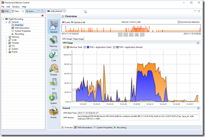
Let’s start by removing the dials in the Overview tab. Don’t worry about messing something up – you can always reset the user interface in the preferences Window | Preferences, Java Mission Control / Flight Recorder -> Reset User Interface. That said, that extreme option will reset all your modifications to factory defaults. You can also undo changes in the design mode, which is more local and usually enough.
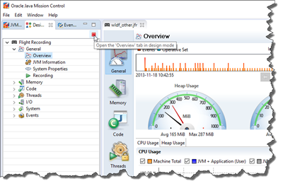
Here we go. Once the Designer View opens, it will show you a tree of the available tabs. In our case we want to edit the Overview. Select the General / Overview Tab, and click the “stop” button to open the Overview Tab in design mode.
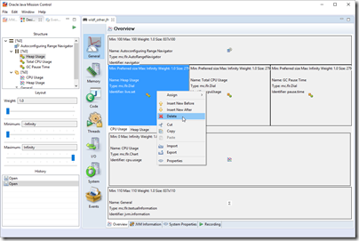
This will show a layout view with boxes representing the different components. Bring up the context menu for one of the dials and select the Delete menu.
Repeat this until you have deleted all the Dials, as well as the container for the dials.
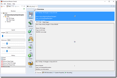
Press the play button in the Designer View to take a look at what your changes look like when live.
No more dials! Let’s take another example.
Adding Table Columns
Let’s say that you want to add some statistics for Servlet invocation events. You have the WLS tabs, but you find the Servlet tab sadly lacking in the critical-pieces-of-information department.
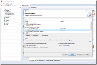
Note: If you do not have a WLS recording, you can download and follow this tutorial to get one. To install the plug-in, simply go to Help | Install New Software… and select the WLS tab pack.
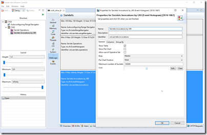
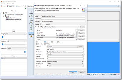
When looking at the fabled Servlet tab, we decide that it would be very nice to see the longest lasting servlet invocations, as well as the standard deviations. First step is to open the Designer View on the Servlet tab. Right click on the Servlet Invocations by URI table (the bottom area), and select properties. You should see something like this:
Select the Columns tab. What do you know; max duration is already there, but it is not visible by default.
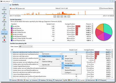
If you find that a table is missing a column with important information, always first check to see if the information is hidden. Go to the table, use the context menu to check what is available under Visible Columns. If there are many columns, use Configure… to see them all.
Click max duration and check the Visible check box.
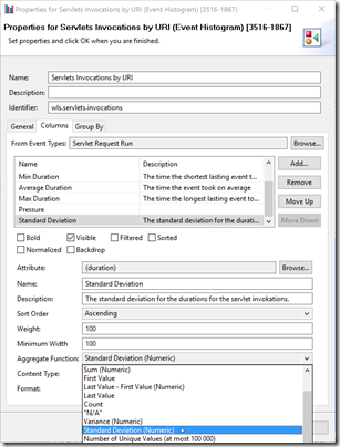
Next we will add a column for the standard deviation. Click the Add… button and select the duration attribute. Click OK in the Add Event Attribute dialog when done. Next edit the Name and Description to something meaningful, then select Standard Deviation as you aggregate function.
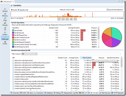
Then hit play to look at your new and now visible column. If you sort on Max Duration, it may look something along the lines of this:
So, what if you want to add your own tab group? Well, let’s use the Smurfberry Exchange example from the tutorial.
Adding Tab Groups and Designing Tabs from Scratch
It is a well known fact that the Smurfs are trading smurfberries on their Smurfberry Exchange (SMX). They have performance problems though, so they have asked us for help. As part of solving their performance issue, we’ve recorded the actual transactions taking place.
For more information on the actual events recorded, see https://hirt.se/blog/?p=277. To solve their problem, look at the jmx.jfr in the tutorial and try to figure out what is going on. The jmx_fixed.jfr contains a recording when the problem is fixed.
This blog entry is however not about helping the smurfs solve their performance problem, but rather about adding a nifty UI so that we can see graphs over the exchange price development over time.
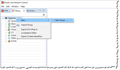
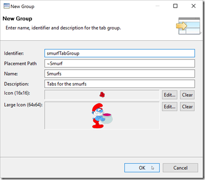
First close any open recording. Structural changes will not be seen in the UI until you have reloaded your recording(s). Next create a group by context clicking the root in the Designer View, and selecting New | New Group.
Edit your group to your satisfaction. Note that the placement path is a lexical comparison of strings. Usually the following format is used: /#1.0. I’ll just add it last.
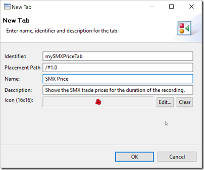
Next, we want to create a tab in the tab group we just created. Context click the tab group and select New | New tab to add the tab. Fill out the New Tab wizard in a similar fashion.
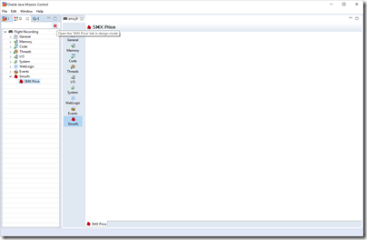
That is enough to get the structure in place. Now open the recording containing the events for wish you want to design. In this case the smx.jfr file. Our new tab will, not very surprisingly, be quite empty.
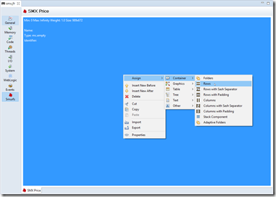
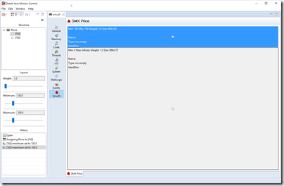
Let’s click the stop button and get to work. We want one of those nifty automatic range navigators on the top, and a big chart showing the price over time. First we fix the layout. Context click on the empty area, and select Assign | Container | Rows to split the area into two.
The range navigators are all usually using 100 pixels, so select the upper container and set min and max to 100 pixels.
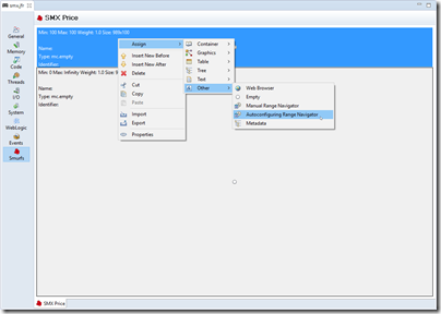
Next context click the upper container and assign it an Autoconfiguring Range Navigator (Assign | Other | Autoconfiguring Range Navigator). The Autoconfiguring Range Navigator shows where all the events that are represented on the tab are located in time, and allows the user to shift the time for all the components of the page, i.e. zoom into various parts of the recording.
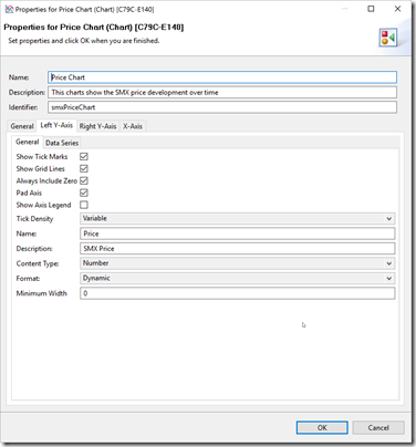
Next we add the price chart. Select the lower container and use the context menu to select Assign | Graphics | Chart. You will now see the properties dialog for the newly added chart. Fill out the base properties.
The only thing of note here is the role selection. It can be used to define a relationship between a master component and a slave component. The slave will only show whatever is selected in the master. We noted that this were never done in more than three steps, so we ended up building the editor around that simple use case. A component can be a Master, Slave or a Slave Child. This is one of the reasons we never started supporting the Designer View. It was built only to be used by JMC developers to quickly build JMC itself. It can sometimes be a bit quirky.
Note that we are not slaving this chart to selections in any master component, so let the role remain Independent.
Next we need to configure the Left Y-axis, and the data series associated with that axis. We will only have one axis. Price is numeric, so the Content Type should be Number.
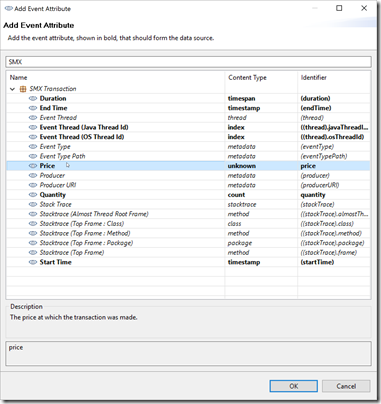
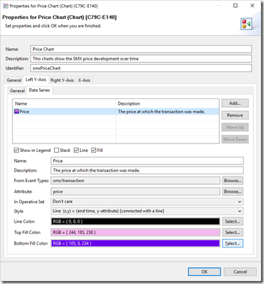
Finally we add the price data series. Click the Data Series tab and the Add… button to add the price attribute. Note that you can type “SMX” in the filter box at the top, to quickly find the right event type to select attributes from.
Next we configure the rendering of the price series. Select to show the legend (mostly useful for when there are multiple series, and you want the user to be able to select which ones to render by clicking the legenes). Select Line and Fill. Don’t forget to select Line (x,y) as style, and three different colors for Line Color, Top Fill Color and Bottom Fill Color, so that you get a nice gradient. 😉
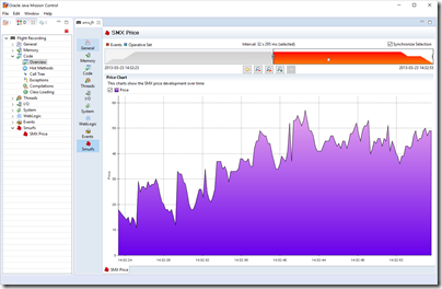
Press the play button in the Designer View to see what it all looks like, working range navigator and all.
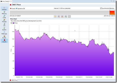
The Smurf economy seems to be doing fairly well. Prices are indeed increasing over time. Or perhaps there is a shortage of Smurfberries. Hard to tell. When looking at the recording where the performance problem has been fixed, the prices seem to falling towards the end. Could be a symptom of the smurfs effectively getting into high frequency trading after fixing the performance bottleneck. 😉
Saving and Sharing Designs
Now that you’ve built some amazing custom visualization, perhaps even for your own custom events, you may want to share it with others. Or even use it yourself. It is very nice to have it stored if you mistakenly press the Reset User Interface button, or if you accidentally FUBAR the user interface making it absolutely necessary to press that button. Or if you want install your changes into JMCs in multiple versions of the JDK.
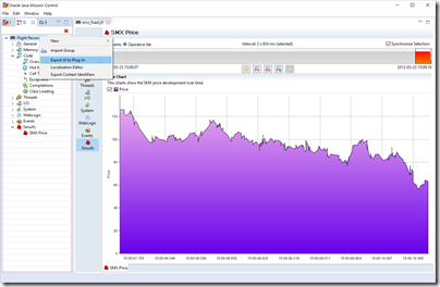
To export your design as a plug-in, simply right click on the root node in the Designer View and select Export UI to Plug-in.
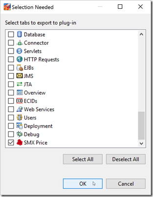
In the export wizard that opens, select the tabs to export. Note that you can select any tabs, even default tabs that you have overridden.
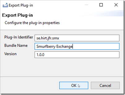
Next you get to select the ID and version of your plug-in. Higher versions will override lower versions.
Click OK to select where to store it. The resulting plug-in can be shared. To use it, simply add the plug-in to the JDK_HOME\lib\missioncontrol\dropins folder.
Summary
In this blog you learnt how to wreak absolute havoc on the JMC user interface. It’s not supported, so don’t come crying if/when something breaks. 😉
I’ve added the SMX plug-in here.
I will so very much regret posting this.
So sad to hear, that this great feature isn’t supported now in recent versions of JMC. =(
Yep, we had to drop that when we were upgrading and refactoring the code base. That said, there is an easy way to easily create and “design” custom pages directly in recent versions of JMC, just not quite as flexible. I think there is an introduction to it in the JMC Tutorial:
https://github.com/thegreystone/jmc-tutorial